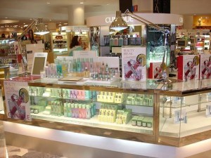
 The visual presentation in the store has always been the major customer motivation accounting for the a majority of retail purchase. Your window display has the potential to attract the customer, reel them in and ultimately lead to purchase. However, there are a few key points every merchandizer should keep in mind.
1. Show less, Focus more The human mind has a limited attention and focus span and therefore it is advisable to keep the display simple and uncluttered. Leave a lot of space around. The most common mistake is trying to show too much at the same time. Props should be simple in shape, preferably something that provides a large mass of color or texture, such as blocks, covered boxes or risers.
2. Love odd numbers Always place an odd number of elements in a group. Since it’s easier for the brain to zone in on the middle and the arrangement is slightly off balance, the eyes moves around to look at each frame or object. A perfectly balanced arrangement ie even no is dull to the eye.
3. Repeat, repeat and repeat Use variations of identical elements as that creates a very powerful display mechanism. It’s a simple idea but can have a lot of impact on the mind of the consumer and it’s hard to miss such a display.
4. Contrast is key Make sure the items or frames you want to focus clearly contrast with the background. This includes color contrast as well as material texture contrast. For example, don’t put a metal frame on top of a glossy background. Try making the background dull and repeated so that the frame that displays important information stands out.
5. Attract first, provide choice later: Pyramid method Place one element at the top of the display which is clear and focussed. Below that, in the form of a pyramid, place other elements which provide choice. It’s hard to go wrong with a pyramid display.
6. BONUS: Always hire a good agency to execute your campaigns. An idea is only as good as it’s execution. So while your presentation might look fabulous in your laptop, the real thing in the store must be as efficiently done.
Good visual merchandising is a mix of art, inspiration and science. While great visual can sell lousy product, poor visuals can do nothing for great merchandise.
Paco Underhill, Why We Buy
Get comfortable with having some empty space in your high fashion displays. Crowding is a symbol of low value. So anything that is high value deserves a lot of space around it. If you keep an expensive item in a crowd the human brain perceives it to be of lower value.
Above all, use the K.I.S.S. theory of display: Keep It Simple, Sweetheart!
Article Credit This article was contributed by Maniraj Singh Juneja, director at Amitoje India: One of India’s best store branding and execution firms based in New Delhi. Check www.amitoje.com for more details. You may write to him at maniraj@amitoje.com